This sheet will give various steps for creating different aspects of a web page for the Instructional Development website. For a more detailed description and other options, please find the relevant section further in the book. To create a page, see the instruction on the Basics page.
Buttons
To add a button, type the text for the button on the page: e.g.,
Teaching
Then select the text and click the link icon below on the Body menu:

Add the URL that you want the button to go to in the URL field. This will cause that text to go to the link supplied when clicked on. Now you can make the linked text into a button by selecting the appropriate button type. Note that creating a button is just a cosmetic look for a link.
1) Add link: Teaching
2) Make the linked text type a button: (Button options will not show up unless it is linked.)
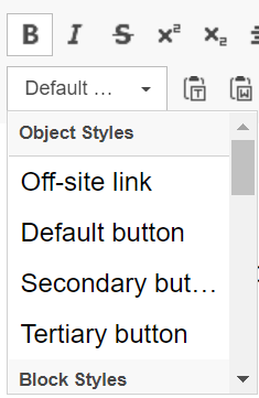
Note that when adding the link, you can add a hover-over display, as in the above teaching example. Under the Advanced tab, see Add a Link dialog below, you can set Alt text for accessibility in the Aria dialog box and set an ID for Jumplinks without editing the HTML. There are three types of buttons:
Secondary used to go to Instructional Development URLs or documents.
Add a Link dialog box:
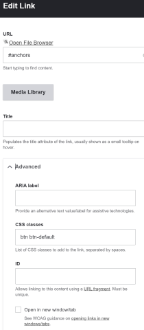
Do not open the link in a new tab or window.
Anchors/Jump Links
Anchors are inserted into the HTML to indicate where on a page a link is supposed to go. The Jump Link is the link that goes to the page and then goes to the location on the page for that anchor. The steps for creating an anchor/jump link in the HTML is:
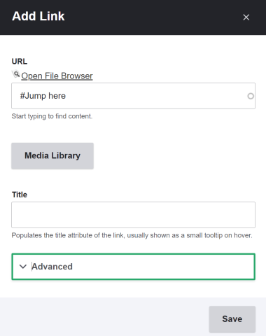
- Tell the link where to jump to: Add an id="name of jump menu link" to any HTML attribute: e.g., <H2 id="Jump here"> or <p id="Jump here">
- Give a target for the link: Add '#Jump here' to the end of a page link or when you do to the link dialog box, just type in #Jump here. This can be done when creating the link or when going back and editing the link.
The advanced option will give other choices but for adding content it is very rarely needed.
To see an in-depth description on how to use Jump Links to Web Theme User Guids/Jump Links.
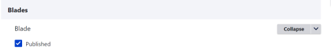
Hiding Blades
You can create a blade and have it visible or not to the user. This is useful for content that must be displayed periodically. Create the blade and make it visible or invisible as needed by checking/unchecking the Published box.
Background colors
You can choose the background color for the entire Blade or just for a particular Column. You can also choose a border color for a column. The following colors are available at the top of the Blade, just the background options, or Column, both.
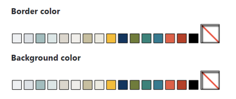
Use them sparingly to make content easier to read and navigate or if you need to show a correlation between columns. Keep any colors consistent with the area that you are in. Also, if you need to create a visual break in the page, see /course-evaluations/overview, add a Decoration Bar, and add padding and color to get the look you want.
Notes:
- Tables do resize in a window
- To visually center a table, you must add a blank column on The left side. If you leave it blank, it will center the image, and when you shrink it so that it stacks the columns, there will be nothing in it, so that the image will be positioned correctly.
- At this time, within the table’s Properties dialog box, the alignment does not work in the cells.
- Cell padding works
- Accordions can be put into side-by-side columns when the screen size shrinks below their width, they will stack
- Use Width under the column options to position an image anywhere on the page horizontally.